
|
|
 | |

Showing posts with label graphic design. Show all posts
Showing posts with label graphic design. Show all posts
Wednesday, December 30, 2020
Say It To Deface
Illustration
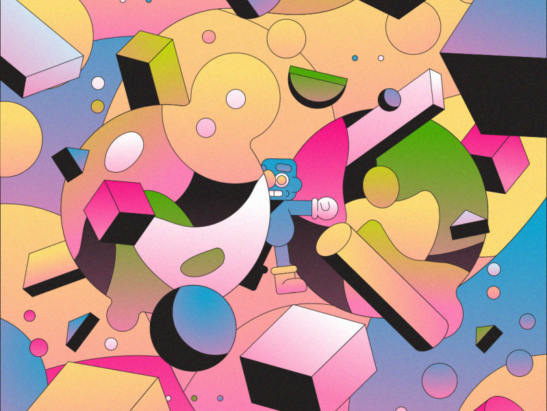
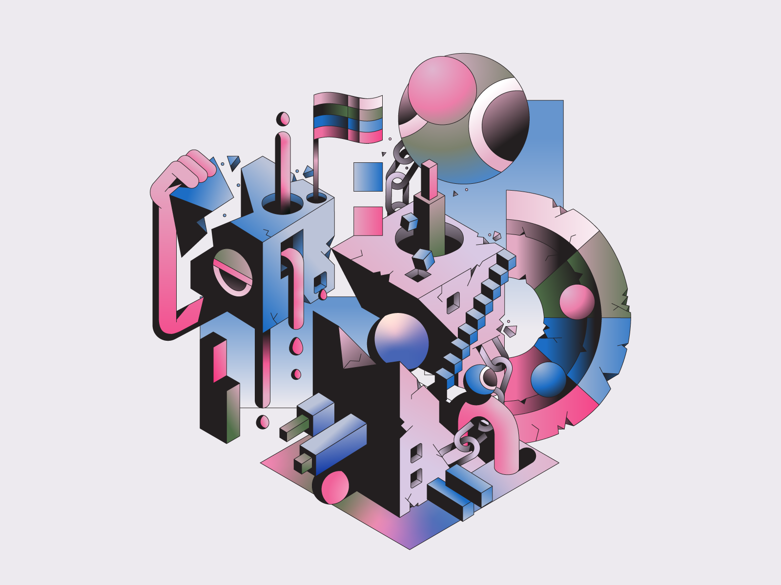
| Kane a.k.a. 'Defaced' from Norwich in the United Kingdom uses Adobe Illustrator and Photoshop to create outstanding surreal pieces. |
llustrator Kane a.k.a. 'Defaced' from Norwich in the United Kingdom uses Adobe Illustrator and Photoshop to create outstanding surreal pieces. —
Much of Defaced's work is inspired by games, with hit point indicators and other game aspects being presented.
"I work with shapes all day," he writes in his Dribble profile.

While most of the illustrator's work is flat, 2D imagery, some pieces do have dimensional aspects applied with simple gradients.
To hire Kane, follow this link.



SOURCE Dribble
| By kree8tiv | Embed |

Tuesday, October 7, 2014
Infographics Designers' Sketchbooks

Books
| In Infographic Designers' Sketchbooks, more than fifty of the world's leading graphic designers and illustrators open up their private sketchbooks to offer a rare glimpse of their creative processes. |
Using a wide variety of techniques, they transform complex ideas into clear, engaging, and memorable infographics. In recent years, books and websites have been collecting the field's best. While stimulating, these finished projects offer little insight into how visual solutions were reached, making them of limited use to designers wanting to produce work of their own.
In Infographics Designers' Sketchbooks
 , more than fifty of the world's leading graphic designers and illustrators open up their private sketchbooks to offer a rare glimpse of their creative processes.
Organized alphabetically by designer, Infographic Designers' Sketchbooks combines both breadth and depth in 352-pages. The topics span range from politics to science to pop culture to finance.
The book excels at showing how essentially dry, complex scientific information is brought to life by storybook-like infographic imagery embedded with raw data. Still, however polished the final product is and whatever data it represents, the common theme is a good old-fashioned sketch at the start.

It is incredibly interesting to go behind the scenes of a designer’s work process, through their sketches.
Author Steven Heller is the cochair of the MFA Designer as Author Department at NY's School of Visual Arts. He is the author of many books, including Graphic, Typography Sketchbooks, Scripts, and Shadow Type.
Co-author Rick Landers is founding partner and co-creative director of graphic design studio Landers Miller Design.

| By kree8tiv | Embed |
Thursday, May 30, 2013
YoAz - Electro Animals

| Graphic designer and illustrator YoAz has created “Electro Animals,” a collection of colorful animal illustrations made of geometric, electric circuit-like designs. |
It was Philip K. Dick who asked Do Androids Dream of Electric Sheep?
 and while Yo Az doesn’t appear to be robot. the artist dreams up electric creatures from a few slightly different species.
Tuesday, April 16, 2013
Fonts & Colors That Drive the World’s Top Brands

Graphic Design
| Tasty Placement's infographic provides some good food for thought if you’ve hit a roadblock on your latest logo design. |
Their infographic provides some good food for thought if you’ve hit a roadblock on your latest logo design.

The team found that most brands opt for a blue logo featuring the world’s most popular sans-serif font, Helvetica. Serif fonts ended up being the least used typeface, although it hasn’t stopped Google from being listed as the #5 top brand in the world.

SOURCE Tasty Placement
| By kree8tiv | Subscribe to kree8tiv |
Thursday, April 11, 2013
Timothy Samara's Design Elements Is Accessible and Informative

Books
| Timothy Samara's book, Design Elements: A Graphic Style Manual, available in print and on Kindle is simply the most compact and lucid handbook available outlining the basic design principles of layout, typography, color usage, and space. |
imothy Samara's book, Design Elements: A Graphic Style Manual , available in print and on Kindle is simply the most compact and lucid handbook available outlining the basic design principles of layout, typography, color usage, and space.
Being a creative designer is often about coming up with unique design solutions. Unfortunately, when the basic rules of design are ignored in an effort to be distinctive, design becomes useless. In language, a departure from the rules is only appreciated as great literature if recognition of the rules underlies the text.
Graphic design is a “visual language,” and brilliance is recognized in designers whose work seems to break all the rules, yet communicates its messages clearly.
, available in print and on Kindle is simply the most compact and lucid handbook available outlining the basic design principles of layout, typography, color usage, and space.Being a creative designer is often about coming up with unique design solutions. Unfortunately, when the basic rules of design are ignored in an effort to be distinctive, design becomes useless. In language, a departure from the rules is only appreciated as great literature if recognition of the rules underlies the text.
Graphic design is a “visual language,” and brilliance is recognized in designers whose work seems to break all the rules, yet communicates its messages clearly.
Monday, March 4, 2013
Game of Thrones Dragon Shadow Campaign

| Designed to light up fantasy fans’ pleasure centers, a clever Game of Thrones advertising campaign features what looks unmistakably like the shadow of one of Khaleesi’s dragons, cast across a series of newspaper articles, buildings and buses. The show will be returning to HBO for a third season on March 31st. |
The "make you do a double-take" ad gives its viewers a taste of what's to come, as Khaleesi Daenerys Targaryen's dragons are sure to be central players of the new season.
Game of Thrones, the series based on the A Song of Ice and Fire books by George R. R. Martin is entering its third season.


Friday, February 15, 2013
The Design Surgery's Report Graphics Provide Clear and Effective Information With Style

| The London design agency, Design Surgery has completed a series of designs for reports that provide companies and organisations with an effective, informative and powerful communications platform for Raconteur Media. |
Each cover visualizes a detailed scene to demonstrate the themes covered throughout the report. The Design Surgery's use of detail, curves and simplified shapes build a cohesive brand image for Raconteur Media.
Illustrated and designed by London design agency, these reports provides companies and organisations with an effective, informative and powerful communications platform that allows them to directly reach their core audience. Raconteur brings together content and sponsors in a credible package of quality journalism and cutting-edge design.
The Design Sugery is a creative agency that thrives on contemporary design. "We are graphical surgeons, passionate problem solvers, emotionally and ethically driven," states their website.
The company prides itself on their in-depth knowledge of visual communication, brand awareness and targeted design. "We examine the boundaries of our clients requirements, revealing a brand's purpose and personality. By identifying the role in which a brand should play, we are able to grasp an accurate understanding of the links between business, brand and consumer."
According to The Design Surgery, design can have a profound effect on how we feel both mentally and physically.

Wednesday, February 6, 2013
Berlin-Based Peachbeach Collaborative Bring Urban Art To Their Graphic Design and Illustration

Urban Art
| PEACHBEACH is an art- and design collective from Berlin, made up of designers and illustrators Attila Szamosi and Lars Wunderlich. |
Wunderlich is from a small town in the north-east of Germany where time runs a bit slower than the rest of the country. Drawing since he was yound, Wunderlich crashed into graffiti in his youth. Then he studied art in a small town up north. After this he started studies again, this time in Berlin and it was graphic design.
Szamosi was born in Budapest, and raised in a small town near Cologne in the west of Germany. He started drawing also really early and was always fascinated by comics and electronic dance music. After school he came to Berlin during his design internship and also to study graphic design.

Monday, February 4, 2013
Japanese Designer Uses Motion To Reveal Hidden Typography

Typography
| The Japanese designer going by the alias, MountStar has taken playful motion graphics to new heights, while using minimalist techniques. In "Hidden Typography," motion graphics are used to reveal words unseen on plain black backgrounds. |
The designer's minimalist take on typography is a playful and effective use of the tools of graphic design to deliver maximum effect.
The series titled, "Hidden Typography," uses motion graphics to reveal words unseen on plain black backgrounds. Water-inspired lines pour over the word, and beams of lines bounce around to reveal another example.

Thursday, January 24, 2013
Ewan Yap Explores BIG BRAND Theory

Branding
| Ewan Yap, a designer based in Malaysia, has created a series of experimental packaging designs based on the principle of BIG BRAND THEORY. In the exploration, Yap crops out as much of the brand as possible, while maintaining the distinctive qualities that make it recognizable. |
The main focus is to have each brand’s identity meticulously and uniquely cropped out of the packaging as much as possible yet maintaining it’s integrity and comprehension at the same time enhancing the aesthetic value.

 | |